

What breaks first if you do nothing on iPhone Duo?
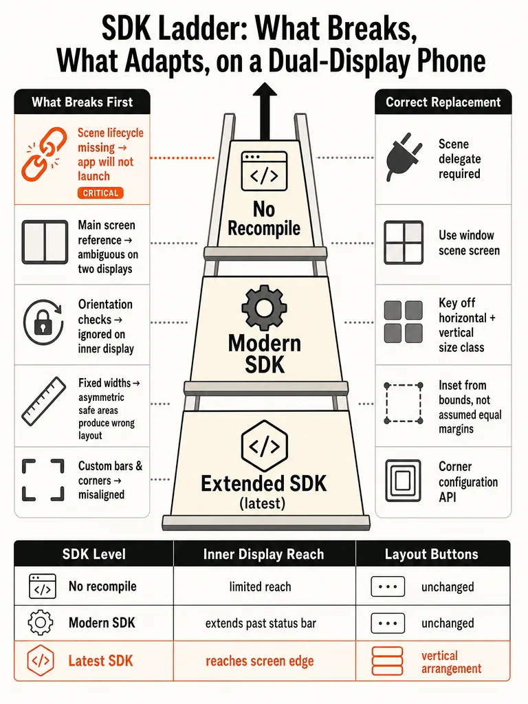
The first failure on iPhone Duo is launch itself. When you build against the latest SDKs, UIScene lifecycle is required, and without a UISceneDelegate the app won't launch at all. That's a crash on start, not a cosmetic problem. Fix scene lifecycle before you touch anything else.
After launch, the failures get quieter and harder to spot. Here's the order they bite, worst first:
- Scene lifecycle. No
UISceneDelegate, no launch when built with the latest SDK. - Main screen references.
UIScreen.mainis ambiguous on a two-display device, and Apple says it will be deprecated. Scale and bounds pulled from it are wrong. - Orientation and idiom checks. The inner display doesn't honor supported interface orientations, and
userInterfaceIdiomstill reports phone even in fully resizable environments. - Fixed widths and asymmetric safe areas. Insets differ side to side, so any hardcoded width or symmetric inset math produces the wrong size.
- Custom bars. Hand-rolled
UIToolbar,UINavigationBar, andUITabBarcontent don't participate in the new side-mounted layout at all. - Opt-in iOS 27.1 APIs. Reserved regions, arrangement views, hinge interactions. Skip these and the app works but looks unfinished next to one that adopted them.
The mandatory fixes are scene lifecycle, screen references, orientation, idiom, and safe-area math. Everything after that is polish, not survival.
This guide walks that ladder in order, using Apple's own API names from the iPhone Duo Tech Talks and WWDC26 session 278.
Do apps need to be rebuilt for iPhone Duo?
An existing iPhone app runs on iPhone Duo without recompiling. What changes is how much screen you get, and that's tied directly to the SDK you build against. Apple's David Jackson lays out the ladder in the Prepare your app for iPhone Duo Tech Talk: each SDK level unlocks more of the display.
| SDK level | What you get |
|---|---|
| No recompile | App runs on iPhone Duo as-is |
| iOS 27 SDK | Content extends left of the status bar on the inner display |
| iOS 27.1 SDK | Content reaches the screen edge; standard navigation and toolbar buttons lay out vertically |
An app that stops at iOS 27 works and resizes, but it looks unfinished beside one rebuilt against 27.1.
Two deadlines land in the same window. From April 2027, apps uploaded to App Store Connect must be built with the iOS and iPadOS 27 SDK or later. Building with the iOS 27 SDK also means App Store Connect validates a launch screen configuration in your Info.plist, per TN3208.
The launch-failure rule bears repeating because it's the sharpest one. UIScene lifecycle is required with the latest SDKs. No UISceneDelegate means the app will not launch, full stop. So "do I need to rebuild?" splits into two answers: not to run, but yes to look right and yes to ship after April 2027.
What are the iPhone Duo screen sizes for developers?
iPhone Duo has two Apple-published displays: a 7.6-inch inner Super Retina XDR folding OLED at 1878x2670 px, 430 ppi, and a 5.4-inch outer Super Retina XDR OLED at 1398x2034 px, 460 ppi. Both run ProMotion to 120Hz, Always-On, HDR, and hit 3000 nits outdoor peak. There is no Apple-published point-size class for either.
That last point matters more than the pixels. The Human Interface Guidelines Layout specifications table still ends at iPhone 17 Pro Max and iPhone Air, and App Store Connect's screenshot specifications page still tops out at the 6.9-inch class. Apple hasn't listed an iPhone Duo point size anywhere.
At the usual 3x scale, the pixel specs work out to roughly 626x890 pt inner and 466x678 pt outer. Treat those as arithmetic from the pixel spec, not official values, and do not hardcode either one. The inner display in portrait is far wider than any iPhone before it, and the outer is wider and much shorter than an iPhone 18 Pro. Neither shape exists on another device, which is exactly why fixed widths break.
Apple says the aspect ratio is consistent across both displays so content scales proportionally. The published pixels give 1.42 inner and 1.45 outer, close but not identical, so read the real size at runtime.
Two more developer facts: authentication moves to Touch ID in the side button, working open or closed, so code that assumes Face ID should read LAContext's biometryType. And the redesigned Dynamic Island sits vertically on the side of both displays.
Read the size you have at runtime; never hardcode a derived point size that Apple hasn't published.
Should I use size classes instead of orientation on iPhone Duo?
Yes. Layout should key off size classes, never supported interface orientations and never userInterfaceIdiom. Apple's Tech Talk is direct about this: the outer display behaves like other iPhones, while the inner display reports a regular size class in both dimensions, which is what makes room for sidebars. The inner display doesn't honor supported interface orientations at all.
Two assumptions fail here even when the app still compiles.
Orientation is now a preference the system may ignore in resizable environments as of iOS 27. Code that branches on supportedInterfaceOrientations for layout will run on the wrong path.
Idiom is worse, because it's misleading in three places at once. An iPhone app on iPad, or in iPhone Mirroring on the Mac, is fully resizable but still reports the phone idiom. Checking userInterfaceIdiom to decide layout was never reliable, and iPhone Duo makes the failure visible.
Read size classes instead:
// SwiftUI
@Environment(\.horizontalSizeClass) private var horizontalSizeClass
@Environment(\.verticalSizeClass) private var verticalSizeClass

// UIKit
traitCollection.horizontalSizeClass
traitCollection.verticalSizeClass
Size classes express the experience your app should provide for the space it actually has, not the shape of the hardware. Apple's session 278, Modernize your UIKit app, names four audit areas in order: scene lifecycle adoption, main screen references, idiom checks, and orientation checks. Three of those four are things to remove, not add.
On iPhone Duo, orientation and idiom describe the wrong thing; size classes describe the space you're laying out into.
Which main screen, trait, and scene geometry calls need to change?
Stop referencing the main screen. On a two-display device it's ambiguous, and Apple says UIScreen.main will be deprecated. Every screen-derived value has a scene-scoped or trait-scoped replacement, and the swaps are mechanical.
Access the screen from the window scene:
let screen = window?.windowScene?.screenReplace scale reads with the trait collection:
// Before
let screenScale = UIScreen.main.scale
// After
let screenScale = traitCollection.displayScale
Replace screen-bounds checks with real available space. Use windowScene.effectiveGeometry, observed through windowScene(_:didUpdateEffectiveGeometry:), or the view's own bounds. On a device that folds, resizes, and mirrors, the screen's full bounds tell you almost nothing about the room your view actually has.
Automatic trait tracking re-invokes layoutSubviews, updateProperties, and drawRect when a tracked trait changes. Where that tracking isn't automatic, for instance when you need to invalidate a cache, register for it explicitly with registerForTraitChanges.
Here's the full replacement map from Apple's guidance:
| Old assumption | Replacement |
|---|---|
UIScreen.main | window?.windowScene?.screen |
UIScreen.main.scale | traitCollection.displayScale |
| Screen bounds for available space | windowScene.effectiveGeometry or view bounds |
| Manual layout on config change | windowScene(_:didUpdateEffectiveGeometry:) |
| Assuming traits refresh for you | registerForTraitChanges where not automatic |
Match the physical screen corners with the iOS 26 Concentricity APIs: ConcentricRectangle in SwiftUI, UICornerConfiguration in UIKit.
Every UIScreen.main read is a bug in waiting on iPhone Duo; move each one to the window scene or the trait collection.
How should safe areas, fixed widths, and custom corners change?
Safe areas are asymmetric on iPhone Duo, so any layout math that assumes opposite insets are equal produces the wrong size. Standard bars lay out outside the safe area and avoid the status bar and camera automatically. Your job is to keep interactive foreground content inside the safe area and let background artwork run past it.
The classic trap is a symmetric width formula. This is wrong:
let width = view.bounds.width - view.safeAreaInsets.left * 2It doubles one side's inset and ignores the other. Do this instead, and handle each edge independently:
let width = view.bounds.inset(by: view.safeAreaInsets).widthFor foreground content, inset by the safe area. For background content, use the full bounds or ignoresSafeArea(). Then test in Split View, where the other app's controls sit on the opposite edge and the insets you assumed won't hold.
Match custom corners to the hardware with ConcentricRectangle in SwiftUI and UICornerConfiguration in UIKit, rather than guessing a radius.
Games are the one edge case with different rules. UIRequiresFullScreen is honored on iPhone in resizable environments from iOS 27, but it no longer opts an app out of resizing. It now enables discrete resizing that honors supported orientations, transitioning to a new screen configuration on each size change so the game renders at full quality in every pose. Fill the screen in each pose, keep text and control sizes consistent, and prefer changing aspect ratio over letterboxing or pillarboxing.
What are reserved regions on iPhone Duo?
Reserved regions are areas of the display shaped by hardware that your content should avoid covering or adapt around. New in iOS 27.1, they model space the safe area alone doesn't describe: the fold and the cameras. Apple's analogy in the Strike a pose with adaptive layouts Tech Talk is iPad window controls, another region your layout already flows around.
There are three on iPhone Duo. The outer front camera is always present and expands into the Dynamic Island. The inner front camera is present only when the camera is active, since the under-display camera stays invisible until then. The folding region is conditional on how the device is held; partially open, it divides the inner display into separate regions and excludes the center.
They come in two kinds. .division regions divide a larger area into smaller ones, like the fold, which is active only when folded and has zero width when flat. .occlusion regions occlude rather than divide, like the FaceTime camera.
Query them in SwiftUI from a GeometryProxy:
GeometryReader { proxy in
  let regions = proxy.reservedRegions(kind: .division)
  let frames = regions.map(\.frame)
}
Only active regions return by default. Inactive ones still inform decisions you make once per layout rather than per fold, like preferring an even number of grid columns:
let regions = proxy.reservedRegions(kind: .division, options: .includeInactive)
let camera = proxy.reservedRegions(kind: .occlusion)
UIKit uses view.reservedRegions(kind: .division) and the type UIViewReservedRegion; SwiftUI's type is ReservedRegion. Apple's advice is narrow: adopt the API for your highest-priority manually laid out controls, not everything.
Reserved regions vs ArrangementView vs hinge APIs: which one solves which problem?
Three iOS 27.1 additions get lumped together as "foldable support," but each solves a different problem, and using the wrong one produces bad layout. Here's the split.
| API | Problem it solves | Use it for |
|---|---|---|
Reserved regions (ReservedRegion, UIViewReservedRegion) | Custom layout around hardware-shaped space | Positioning your own controls around the fold and cameras |
Arrangement views (ArrangementView, UIArrangementViewController) | Structuring two views as the device opens and closes | Split or overlay presentations of a primary and secondary view |
Hinge APIs (onHingeChange, UIHingeInteraction) | Interaction and effects driven by fold angle | Expressive input, never layout |
The rule that keeps these straight: reserved regions and arrangement views are for layout, hinge data is not. Apple is explicit that hinge angle drives interactions and effects, and layout belongs to the arrangement and reserved-region APIs. Their demo maps hinge angle to a guitar whammy-bar pitch bend, expressive input, not geometry.
If you're deciding where custom controls go around the fold, that's reserved regions. If you're deciding whether two views split or stack, that's an arrangement. If you want the fold angle to change a value in your app, that's the hinge API.
Reserved regions shape where things sit, arrangements decide how two views coexist, and hinge data drives behavior, so never reach for the hinge API to move a view.
How do ArrangementView and UIArrangementViewController work on iPhone Duo?
An arrangement view holds two views, a primary and a secondary, and organizes them from three inputs: size classes, aspect ratio, and active division regions. It outputs whether each view shows and what frame it gets. ArrangementView is the SwiftUI container, UIArrangementViewController the UIKit one, both new in iOS 27.1.
In SwiftUI:
NavigationStack {
  ArrangementView {
    PlayerView()
  } secondary: {
    UpNextView()
  }
  .arrangementViewStyle(.split)
}
In UIKit, UIArrangementViewController is the root of your UINavigationController, configured with setViewController(_:for: .primary) and setViewController(_:for: .secondary).
There are two styles. .split, the default, divides bounds horizontally when wider than tall and vertically when taller. Restrict it with .split.axes(.horizontal); when it can't split along its primary axis, it shows a single view. .overlay prefers stacking above or below and moves side by side when the device folds. Read the overlay z-index to adapt the overlaid view:
@Environment(\.overlayArrangementZIndex) private var zIndex
// zIndex > 0 ? .collapsed : .expanded
In UIKit, read arrangementVC.state(for: .primary)?.zIndex.
Choosing between them follows the layout you already have. HStack/VStack translates to split, ZStack to overlay. With no existing pattern, use overlay for a clear foreground/background relationship where partially obscuring the background is fine, Apple's example is Accessibility Reader. Use split for main/detail where neither view should be covered, like the Podcasts transcript.
Two hard limits: don't put a navigation container like NavigationSplitView inside an arrangement, since it provides no navigation infrastructure, put NavigationStack around it instead. And never put an ArrangementView inside a List or ScrollView.
When do vertical bars overflow, and when should you opt out?
Vertical bars overflow when items don't fit, most often on the outer display in landscape and when the keyboard competes for space. Items overflow bottom to top by default, and the toolbar compresses before the tab bar, which suits navigation-focused apps. Task-oriented apps can minimize the tab bar instead.
Control what goes first with ToolbarItemVisibilityPriority or UIBarButtonItemVisibilityPriority. Set priority on whole groups first, then individual items. Keep frequent actions like Compose last to overflow and keep badged status items visible. Move custom overflow into the system menu with ToolbarOverflowMenu or additionalOverflowItems plus UIDeferredMenuElement, and reserve the ellipsis for overflow only.
Opting out exists through toolbarVerticalBehavior and UIVerticalBarBehavior, and Apple says generally don't. The two cases it names are narrow: a single-page bottom-heavy layout like Calculator, and a sheet carrying only a Close button.
Calculator is worth noting as the model for the harder path. On the outer display it rearranges from four columns of five buttons to five columns of four. That's rethinking a grid for the new shape rather than scaling one, which is what most apps should do instead of opting out.
How should sidebars, Split View, and standard containers adapt?
Most standard containers adapt to iPhone Duo for free. NavigationStack, NavigationSplitView, TabView, List, ScrollView, and UISplitViewController are fully adaptive across every pose: columns collapse when closed and tile or overlay when open. Alerts, action sheets, menus, popovers, context menus, and sheets reposition to stay visible. Split views adjust column widths and margins to the inner display's symmetry. You get all of this without adopting anything.
Where you opt in is richer navigation on the inner display's extra room. Show a sidebar:
// SwiftUI
TabView { … }.defaultTabBarPlacement(.sidebar)

// UIKit
tabBarController.sidebar.preferredPlacement = .sidebar
Check for room first with sidebar.isAvailable rather than forcing a sidebar into a pose that can't hold it. iOS 27 also added prominentTabIdentifier for a tab that survives tab bar collapse, useful when one destination must always stay reachable.
The reserved-region APIs handle the fold inside these containers automatically. A split view like Reminders keeps both columns visible with an even split, and a grid can preserve its outer margins while increasing spacing around the hinge, without you querying anything.
If you're already using standard navigation and content containers, most of iPhone Duo layout is handled the moment you rebuild against iOS 27.1.
The decision that matters here is whether you built on standard containers or rolled your own. Standard containers get the adaptation for free. Custom layouts have to opt into reserved regions and arrangement views by hand.
How do I handle multiple displays and scenes on iPhone Duo?
iPhone Duo is the first iPhone to support multiple instances of an app's UI. If your app already supports multiple windows on iPad, you get that support on iPhone Duo for free. Split View puts two apps side by side on iPhone for the first time, and two windows of one app are possible.
One limitation shapes the code: new windows cannot be created on the outer display, which is reserved for the inner display. So handle errors when requesting a scene, and prefer the UIWindowSceneActivation action, which hides itself automatically when new windows are unavailable rather than presenting a control that will fail.
Scene accessories are the other half. They place app content on both displays at once. The system controls availability dynamically, enabled by default but revocable at any time, so observe availability instead of assuming it.
For camera apps, CameraCaptureAccessory pairs UI on the outer display while the main UI stays on the inner one. Apple's examples are a teleprompter, or showing something fun to a child you're photographing. It's available when your app is full screen on the inner display with an active camera session, and you register it on the same view as your camera UI:
CameraView(model: model)
  .sceneAccessory {
    CameraCaptureAccessory(isEnabled: $model.isEnabled) {
      TeleprompterView(model: model)
    }
    .onAvailabilityChange { newValue in model.isAvailable = newValue }
  }
  .toolbar { TeleprompterToggle(isEnabled: $model.isEnabled).disabled(!model.isAvailable) }
The pattern to internalize: availability is a moving target on this device. Observe it, disable UI when the accessory or scene isn't available, and never treat a successful request as permanent.
Virtual front camera vs individual devices: what should camera apps use?
Pick the virtual front camera when 1080p and 60fps are enough, and individual devices when you need the outer camera's full range or depth. iPhone Duo is the first iPhone with two front cameras, both square sensors with ultrawide field of view. The outer sits outside; opening the device reveals the inner one, the first under-display camera on iPhone.
The trade-off is capability against effort:
| Virtual front camera | Individual devices | |
|---|---|---|
| API | AVCaptureDeviceDiscoverySession, position .front | Built-in outer + inner ultrawide, accessed directly |
| Switching | Automatic (inner when open, outer when closed) | Your responsibility |
| Outer capability | Limited to common capabilities | Up to 4K, up to 120fps |
| Inner capability | Limited to common capabilities | 1080p up to 60fps |
| Resolution ceiling | 1080p at 60fps | Full per-camera range |
| Depth | Not available | Available |
The virtual front camera exposes only what both cameras share, which is why it caps at 1080p, 60fps, and no depth. Individual devices give everything but hand you the switching problem.
That switching problem has a subtle trap. AVCaptureDevice.position has always been .back or .front, and both front cameras report .front, but the two displays can face opposite directions, so "front" stopped meaning "facing the user." AVCaptureDeviceDirectionCoordinator in AVKit fixes it. Give it your UIView, the device types to monitor, and a change handler; it reports which cameras are forward- and backward-facing relative to that view. Opening the device moves the view to the inner display and fires your handler, which then reports the inner front camera as forward-facing. Use one coordinator per UIView, since each reports relative to its own view.
The coordinator is main-actor isolated, so don't call AVFoundation from its handler. It hands you an AVCaptureDeviceDescriptor, which is sendable and main-actor-safe, to pass to your camera actor. On a direction change, reconfigure the AVCaptureSession to keep streaming from the forward-facing camera, reconsider mirroring (mirror the preview when the rear camera is forward-facing for a natural selfie), and update UI.
For preview polish, use videoGravity on AVCaptureVideoPreviewLayer and dynamicAspectRatio on AVCaptureDevice to pick a landscape aspect ratio when streaming from the ultrawide front cameras. For rotation, adopt AVCaptureDeviceRotationCoordinator, which updates when the app moves between displays, then disable camera sensor orientation compensation, which is enabled on all iPhone Duo front cameras, to improve performance.
What should I test in Xcode 27.1, Device Hub, and App Resizability?
Test every pose in the iPhone Duo simulator through Device Hub before you call the app ready. Xcode 27.1 beta carries the SDKs and the simulator, and Apple describes it as coming later in September on its iPhone Duo developer page. Device Hub has on-screen controls to open, close, rotate, and fold the device, so you can check layout in each state instead of guessing.
Run this pass:
- Launch in the simulator built against the iOS 27.1 SDK. If it doesn't launch, your
UISceneDelegateis missing. - Use Device Hub to open, close, rotate, and fold, watching for content that lands under the fold or camera.
- Switch to arbitrary resize mode in Device Hub and Xcode Previews to check the app across the full continuum of sizes, not just the two display shapes.
- Test Split View, where the other app's controls sit on the opposite edge and your asymmetric safe-area math gets exercised.
The App Resizability skill, renamed from the modernization skill in WWDC26 session 278 and now covering SwiftUI and iPhone Duo in Xcode 27.1, automates the mechanical conversions. It converts main screen calls to traitCollection or scene bounds checks with invalidation logic, replaces interface orientation checks with size class checks, and can convert an app to scene lifecycle. It asks clarifying questions and leaves comments for what one pass couldn't resolve. Read those comments, they mark the work the tool couldn't finish.
Running a coding skill like this well is a system, not a single button. If you're leaning on AI to do the migration grind, the review flow matters as much as the tool: here's the best AI agent coding setup for 2026 for how to keep agent-generated changes from drifting.
iPhone Duo readiness checklist ordered by what breaks first
Work this list top to bottom. It's ordered by severity: the first item is a launch failure, the last is optional polish. Fix each before moving on.
- Scene lifecycle. Adopt
UISceneDelegate. Without it, an app built with the latest SDK won't launch. This is non-negotiable and comes first. - Main screen references. Replace
UIScreen.mainwithwindow?.windowScene?.screen, andUIScreen.main.scalewithtraitCollection.displayScale. It's ambiguous on two displays and Apple says it will be deprecated. - Orientation checks. Stop branching layout on supported interface orientations; the inner display doesn't honor them. Move to
horizontalSizeClassandverticalSizeClass. - Idiom checks. Remove
userInterfaceIdiomlayout logic. It reports phone even on iPad and in iPhone Mirroring, where the app is fully resizable. - Fixed widths and asymmetric safe areas. Kill hardcoded widths and symmetric inset math. Use
view.bounds.inset(by: view.safeAreaInsets).widthand handle each side independently. Test in Split View. - Custom bars. Move hand-rolled
UIToolbar,UINavigationBar, andUITabBarcontent to navigation-container bars, or they won't participate in side-mounted layout at all. - Reserved regions. For high-priority manually laid out controls, query
.divisionand.occlusionregions so content avoids the fold and cameras. - Arrangement views. Where you have a two-view primary/detail or foreground/background relationship, adopt
ArrangementVieworUIArrangementViewControllerwith split or overlay. - Hinge interactions. Add
onHingeChangeorUIHingeInteractiononly for effects and input, never layout, and always check for a nil hinge. - Multiple scenes. Handle scene-request errors, prefer
UIWindowSceneActivation, and observe scene-accessory availability. - Camera routing. Choose the virtual front camera or individual devices, and adopt
AVCaptureDeviceDirectionCoordinatorif you go individual. - Device Hub testing. Run every pose plus arbitrary resize, and read the comments App Resizability left behind.
Items 1 through 6 are survival. Items 7 through 12 are the difference between an app that works and one that looks built for the device. If you'd rather hand the whole migration to someone who ships production iOS, not demos, that's what we do.
Frequently asked questions
What breaks first if I do nothing to my app for iPhone Duo?
The app won't launch. When built against the latest SDKs, UIScene lifecycle is required — no UISceneDelegate means a crash at start, not a cosmetic glitch. After that, failures get quieter: UIScreen.main returns ambiguous values on a two-display device, orientation checks run on the wrong path because the inner display ignores supportedInterfaceOrientations, and any hardcoded width or symmetric safe-area math produces the wrong size. Fix scene lifecycle before touching anything else.
Do I need to rebuild my app for iPhone Duo or does it just run?
It runs without recompiling, but how much screen it gets depends on the SDK. The iOS 27 SDK extends content left of the status bar on the inner display. The iOS 27.1 SDK reaches the screen edge and moves standard navigation and toolbar buttons to the side. Starting April 2027, App Store Connect requires apps to be built with the iOS 27 SDK or later — so "runs" and "ships" have different deadlines.
What are the iPhone Duo screen sizes and point sizes for developers?
Apple has published pixel specs but no official point sizes. The inner display is 7.6 inches at 1878×2670 px and 430 ppi; the outer is 5.4 inches at 1398×2034 px and 460 ppi. At 3x scale, that works out to roughly 626×890 pt inner and 466×678 pt outer — treat those as arithmetic from the pixel spec, not official values. Apple's HIG layout table still ends at iPhone 17 Pro Max. Never hardcode either derived size; read available space at runtime.
Should I use size classes instead of interface orientation on iPhone Duo?
Yes — orientation checks are unreliable on iPhone Duo. The inner display doesn't honor supportedInterfaceOrientations at all, and as of iOS 27, orientation is a preference the system may ignore in resizable environments. userInterfaceIdiom is equally misleading: it still reports phone even on iPad or in iPhone Mirroring. Read horizontalSizeClass and verticalSizeClass instead — in SwiftUI via @Environment, in UIKit via traitCollection.
How do ArrangementView and UIArrangementViewController work on iPhone Duo?
Both are new in iOS 27.1 and hold a primary and secondary view, organizing them based on size classes, aspect ratio, and active division regions. The .split style divides bounds horizontally when wider than tall, vertically when taller. The .overlay style stacks views and moves them side by side when the device folds — read overlayArrangementZIndex to know which is on top. Don't put NavigationSplitView inside an arrangement, and never nest ArrangementView inside a List or ScrollView.
What happens to toolbars and tab bars on iPhone Duo?
On the outer display and the inner display in landscape, toolbars, tab bars, and navigation controls rotate 90 degrees and move to the side edge. The inner display in portrait is the only pose that keeps horizontal bars. Only bars from navigation containers participate — toolbar with NavigationStack, UINavigationController, and UITabBarController. Custom UIToolbar, UINavigationBar, or UITabBar content is ignored entirely and gets no side-mounted treatment.